What is a module?
Modules define how to render a page part.
For example, a module defines rendering the page hero, and another module the hamburger menu.
The next paragraph describes the JSON fields that define modules.
Defining modules
The modules' definition is a JSON array of layout definitions.
The fields that define a module are:
Name Type Is Mandatory Description key Object Yes Represents the unique human-readable identifier of the layout label String Yes Friendly name of the layout shown on the Page Builder description String No Description of the layout shown as helper in the Page Builder typeFullName String Yes By convention, use key.id iconType String No The image format of the icon (e.g., "png"). iconBytesBase64 No No The icon image content encoded in Base64. properties Object Yes Properties defined on this module
key (object fields) Name Type Is Mandatory Description id String Yes Unique identifier (PascalCase, no spaces). If the key.id does not comply with PascalCase or contains spaces, it will be automatically transformed (e.g., "my module" becomes "Mymodule") namespace String Yes Group of modules the module belongs to. By convention, use the format {page-type-name}_Module.
properties (object fields) Same definition as in the template JSON.
Samples
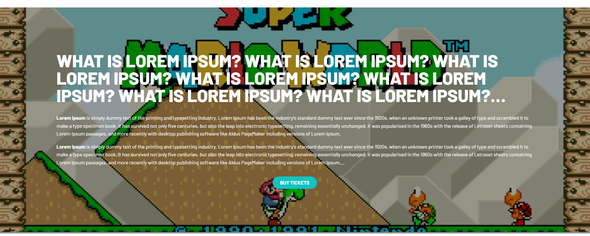
Hero with dynamic portrait thumbnails
The Hero section consists of a full-width container featuring a prominent headline and subheadline. It includes dynamic portrait thumbnails:
The Hero JSON definition is:
Expand All Collapse All Copy JSON
▼ "root" : {
▼ "key" : {
"id" : "HeroDynamicThumbsPortraitSmall"
"namespace" : "react_Module"
}
"label" : "Hero Dynamic Thumbnails Portrait Small"
"description" : "A module to render Editorial list in hero view"
"iconType" : "png"
"iconBytesBase64" : "--bytes--"
▼ "properties" : [
▼ "0" : {
"name" : "hideModule"
"typeName" : "Boolean"
"category" : "Visual"
"description" : "Turn off the module temporarily"
"displayName" : "Hide module"
"isBrowsable" : true
}
▼ "1" : {
"name" : "colorSchema"
"typeName" : "String"
"category" : "Visual"
"description" : "Default value is light"
"displayName" : "Color Schema"
"isBrowsable" : true
▼ "pickList" : {
▼ "values" : [
▼ "0" : {
"value" : "light"
"description" : "Light"
}
▼ "1" : {
"value" : "dark"
"description" : "Dark"
}
]
}
}
▼ "2" : {
"name" : "removeSpacingTop"
"typeName" : "Boolean"
"category" : "Visual"
"description" : "Set true if you want to remove the top spacing"
"displayName" : "Remove top spacing"
"isBrowsable" : true
}
▼ "3" : {
"name" : "removeSpacingBottom"
"typeName" : "Boolean"
"category" : "Visual"
"description" : "Set true if you want to remove the bottom spacing"
"displayName" : "Remove bottom spacing"
"isBrowsable" : true
}
▼ "4" : {
"name" : "isAnimated"
"typeName" : "Boolean"
"category" : "Animation"
"description" : "Turn on the animation"
"displayName" : "Enable Animation"
"isBrowsable" : true
}
▼ "5" : {
"name" : "effect"
"typeName" : "String"
"category" : "Animation"
"description" : "Default value is slide"
"displayName" : "Effect type"
"isBrowsable" : true
▼ "pickList" : {
▼ "values" : [
▼ "0" : {
"value" : "slide"
"description" : "Slide"
}
▼ "1" : {
"value" : "fade"
"description" : "Fade"
}
]
}
}
▼ "6" : {
"name" : "autoplayDuration"
"typeName" : "Int32"
"category" : "Animation"
"description" : "Seconds per item in carousel, default value 8 and min value 1"
"displayName" : "Autoplay Duration"
"isBrowsable" : true
}
▼ "7" : {
"name" : "skip"
"typeName" : "Int32"
"category" : "Data"
"description" : "number of items to be skipped"
"displayName" : "Skip"
"isBrowsable" : true
}
▼ "8" : {
"name" : "limit"
"typeName" : "Int32"
"category" : "Data"
"description" : "number of items to be fetched"
"displayName" : "Limit"
"isBrowsable" : true
}
▼ "9" : {
"name" : "selectionSlug"
"typeName" : "String"
"category" : "Data"
"description" : "The selection slug, do not use if you need one type list"
"displayName" : "Selection Slug"
"isBrowsable" : true
▼ "contentPicker" : {
"searchFieldName" : "slug"
"typeOfSelectedContent" : "selection"
}
}
]
"typeFullName" : "HeroDynamicThumbsPortraitSmall"
}
The Promo section consists of a full-width container featuring a prominent headline, subheadline, and call-to-action:
The Promo JSON definition is:
Expand All Collapse All Copy JSON
▼ "root" : {
▼ "key" : {
"id" : "Promo"
"namespace" : "react_Module"
}
"label" : "Promo"
"description" : "The module will render a Promo"
"iconType" : ""
"iconBytesBase64" : ""
▼ "properties" : [
▼ "0" : {
"name" : "hideModule"
"typeName" : "Boolean"
"category" : "Visual"
"description" : "Turn off the module temporarily"
"displayName" : "Hide module"
"isBrowsable" : true
}
▼ "1" : {
"name" : "isFullWidth"
"typeName" : "Boolean"
"category" : "Visual"
"description" : "Set true if you want a full screen view"
"displayName" : "Full screen view"
"isBrowsable" : true
}
▼ "2" : {
"name" : "colorSchema"
"typeName" : "String"
"category" : "Visual"
"description" : "Default value is light"
"displayName" : "Color Schema"
"isBrowsable" : true
▼ "pickList" : {
▼ "values" : [
▼ "0" : {
"value" : "light"
"description" : "Light"
}
▼ "1" : {
"value" : "dark"
"description" : "Dark"
}
]
}
}
▼ "3" : {
"name" : "removeSpacingTop"
"typeName" : "Boolean"
"category" : "Visual"
"description" : "Set true if you want to remove the top spacing"
"displayName" : "Remove top spacing"
"isBrowsable" : true
}
▼ "4" : {
"name" : "removeSpacingBottom"
"typeName" : "Boolean"
"category" : "Visual"
"description" : "Set true if you want to remove the bottom spacing"
"displayName" : "Remove bottom spacing"
"isBrowsable" : true
}
▼ "5" : {
"name" : "isAnimated"
"typeName" : "Boolean"
"category" : "Animation"
"description" : "Turn on the animation"
"displayName" : "Enable Animation"
"isBrowsable" : true
}
▼ "6" : {
"name" : "titleHeadingLevel"
"typeName" : "String"
"category" : "SEO"
"description" : "headline/title heading level to be used on FE, default value H2"
"displayName" : "Title Heading Level"
"isBrowsable" : true
▼ "pickList" : {
▼ "values" : [
▼ "0" : {
"value" : "h1"
"description" : "H1"
}
▼ "1" : {
"value" : "h2"
"description" : "H2"
}
▼ "2" : {
"value" : "h3"
"description" : "H3"
}
▼ "3" : {
"value" : "h4"
"description" : "H4"
}
▼ "4" : {
"value" : "h5"
"description" : "H5"
}
]
}
}
▼ "7" : {
"name" : "slug"
"typeName" : "String"
"category" : "Data"
"description" : "The promo slug"
"displayName" : "Promo Slug"
"isBrowsable" : true
▼ "contentPicker" : {
"searchFieldName" : "slug"
"typeOfSelectedContent" : "promo"
}
}
]
"typeFullName" : "Promo"
}
Use cases
When defining how to render page parts, modules may refer to content or assets from many sources. The following use cases show examples of module definitions in those scenarios.
Relating to entities from the Content Manager by slug
Suppose your module describes how to render an album based on its slug.
Add a property to set the slug:
{ "name" : "slug" , "typeName" : "String" , "category" : "Data" , "description" : "Get an Album entity by slug" , "displayName" : "Album slug" , "isBrowsable" : true , "contentPicker" : { "searchFieldName" : "slug" , "typeOfSelectedContent" : "album" } } Relating to assets from the Graphic Asset Dashboard by tag
Suppose your module describes how to render graphic assets based on their tag.
Add a property to set the tag:
{ "name" : "assetTag" , "typeName" : "String" , "category" : "Data" , "description" : "Set the Tag to filter the asset" , "displayName" : "Tag" , "isBrowsable" : true } Relating to blogs from LIVE BLOGGING by slug
Suppose your module describes how to render a blog timeline.
Add a property to set the slug:
{ "name" : "slug" , "typeName" : "String" , "category" : "Data" , "description" : "Get a LiveBlogging by slug" , "displayName" : "LiveBlogging slug" , "isBrowsable" : true }